Case studyProduct design, concept
- Winning the return ticket at checkout

Most travellers book the bus out and leave the way back for later. About a quarter of the travellers I surveyed had booked it on another app. I redesigned the moment RedBus asks about the return, so it can be booked in the same checkout, without a date.
The problem
The only way to keep a return on RedBus is to buy it, and buying it needs a date. ~74% of travellers I surveyed left it for later.
What I designed
A return you can book without a date. Say how sure you are, pick a day from your window, and move it once if plans change.
Why it matters
Every return booked later is a second commission RedBus can lose. ~26% of the travellers I surveyed had booked a later return on another app.
The prototype, on video
I understand the time constraint, so here’s the whole flow in two minutes.
If you’d rather watch than read, start here. Tia books a bus to Nainital, keeps a return without knowing the date, and moves it when her plans change. It’s recorded from the working prototype, so every tap is what the prototype does.
Want to use it yourself? Open the prototype, with all 38 screens and 13 states.
Act 1The problem
The return that never gets booked
It starts with one traveller and a ticket she couldn't move.
Tia
Tia booked her return early once. Never again.
Her plans moved and the ticket couldn't. "We regretted it," she told me. Now she books a day or two before and ends up at the back of the bus, where she gets motion sick.
The way out
Delhi → Nainital
Thu, 10 Sep, 23:55, Seat U4
BookedThe way home
Nainital → Delhi
Some day next week. Maybe.
Not bookedThe pattern
Most people wait to book the return. Nobody forgets.
I interviewed 8 travellers and ran a survey with 61 responses, 23 of whom had taken a round trip by bus. Every late booking was a choice.
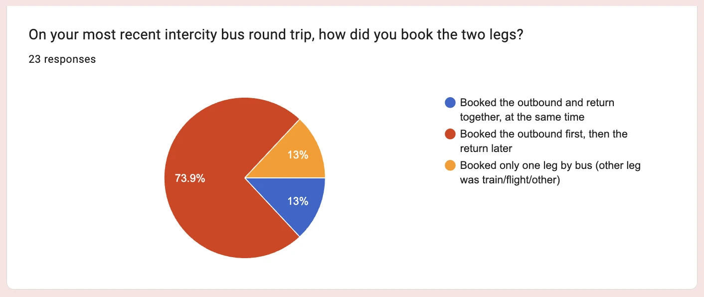
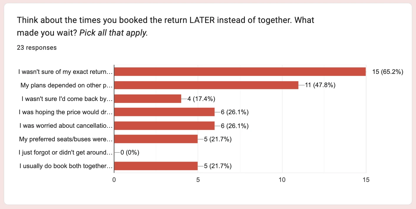
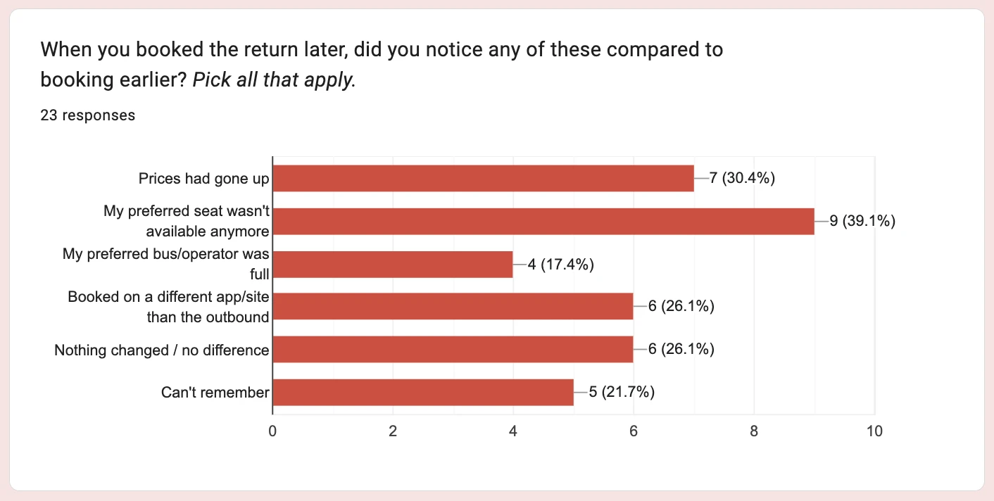
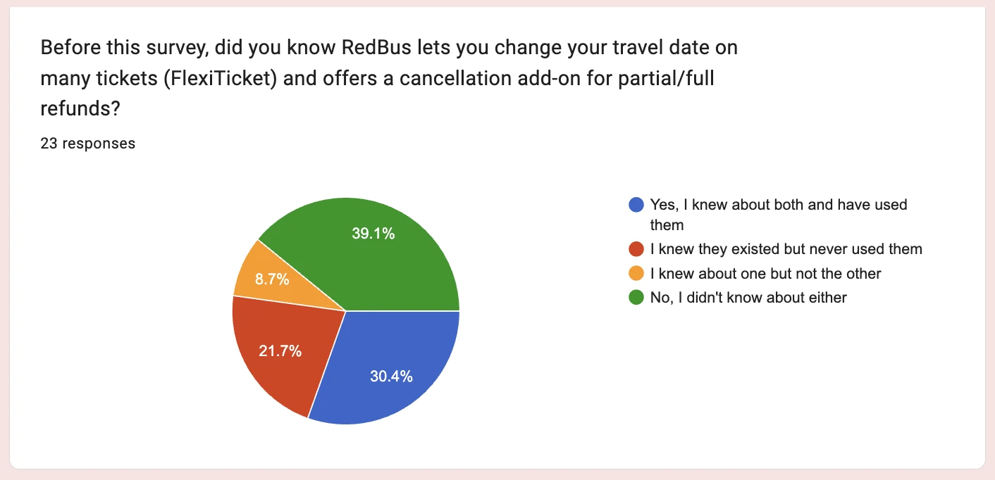
Survey figures are out of those 23. The charts are the form's own, from its responses page.
What RedBus has
The fix already exists. It's a badge on a bus.
FlexiTicket lets you change your date for free. You meet it on a bus card, never when you decide about the return, and ~39% of my survey had never heard of it or the add-on.
The same promise, as a badge on one bus
a property of the bus, not a way to book
10% off the return, on some buses
and people still book it later
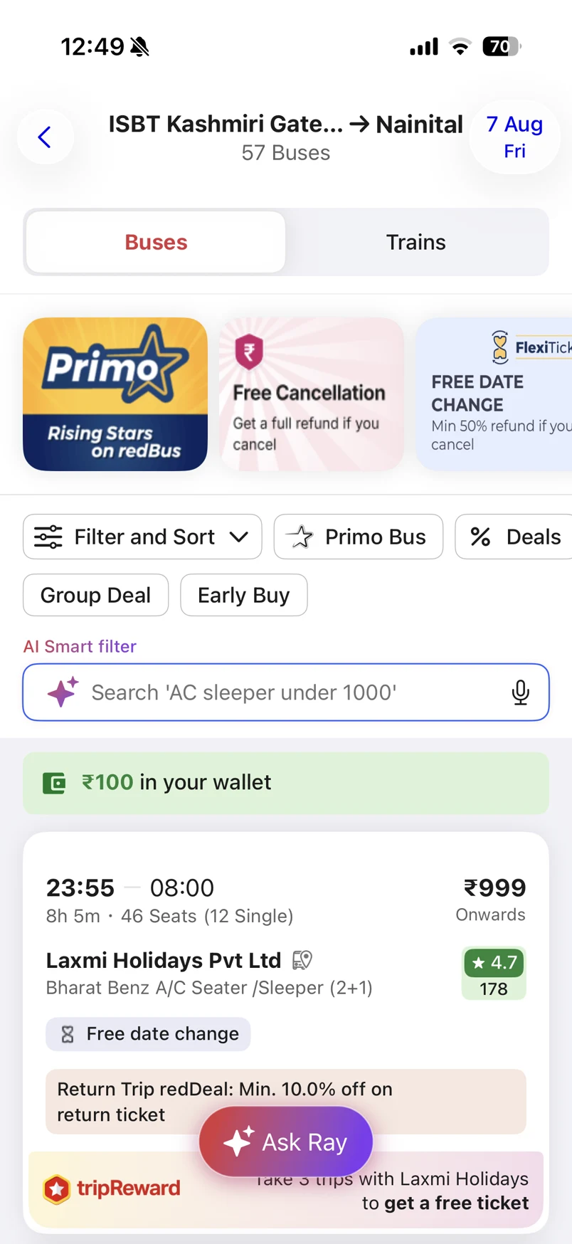
FlexiTicket: free date change
a banner and a filter, on the bus list
The live RedBus app, August 2026.
Why not FlexiTicket
So why not just use FlexiTicket?
It is FlexiTicket underneath. I didn't add anything it can't already do. But FlexiTicket only helps once you've decided to book, and to reach it you first have to enter a date. The people I was designing for didn't have one.
of travellers said that even with a fixed return date, they still book it separately
"I know there is an option but I just prefer okay this option doesn't exist"
Anand, who knew FlexiTicket existed
The app used to ask for a "Date of journey". Now it asks "When can you travel back?"
The knot
The rules made waiting the safe choice.
Staying flexible means juggling seven rules across two products. One of them cancels the other, so people keep their options open by booking nothing.
FlexiTicket
free, on some buses
- Change the date once
- Pay the difference if it costs more
- Nothing back if it costs less
- Up to 8 hours before
Free Cancellation
₹60 per passenger
- Cancel for a full refund
- Up to 6 hours before
Change the date, and the ticket can never be cancelled.
The Free Cancellation you paid for is gone too. RedBus's own help page says so.
Why RedBus should care
A return booked later is often booked elsewhere.
Winning the return inside the first booking is cheap. Losing it is a whole second ticket gone.
booked it on another app
For RedBus, waiting often means losing the return.
commissions, one booking
A return added now costs nothing extra to win.
Free Cancellation sales
The risk: a movable return might replace the add-on.
The limits
I couldn't hold a seat, set a fare or change a rule.
Someone who doesn't know their return date has no way to hold a return on RedBus. Since RedBus sells other companies' buses, I could only change what the app asks and when.
FlexiTicket's rules, as they are
- One change, ever
- Pay the difference if the new day costs more
- Nothing back if it costs less
- No cancelling after a change
- Change up to 8 hours before
My own limit: with the new step, finished outbound bookings must stay at 95% or more of what they are today.
Act 2The design
The return, inside the checkout
Here's Tia's next booking with the new flow. Every scene is a screen from the working prototype.
Scene 1Booking the way out
She books her bus out. Before she pays, the app asks about the return.
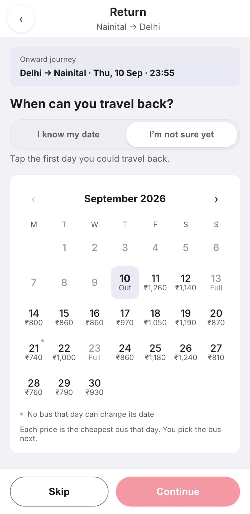
How do you book a day you don't know? You say so. It opens on "I'm not sure yet", the answer ~65% of my survey gave.
Opens on "I'm not sure yet"
people who know their date lose one tap
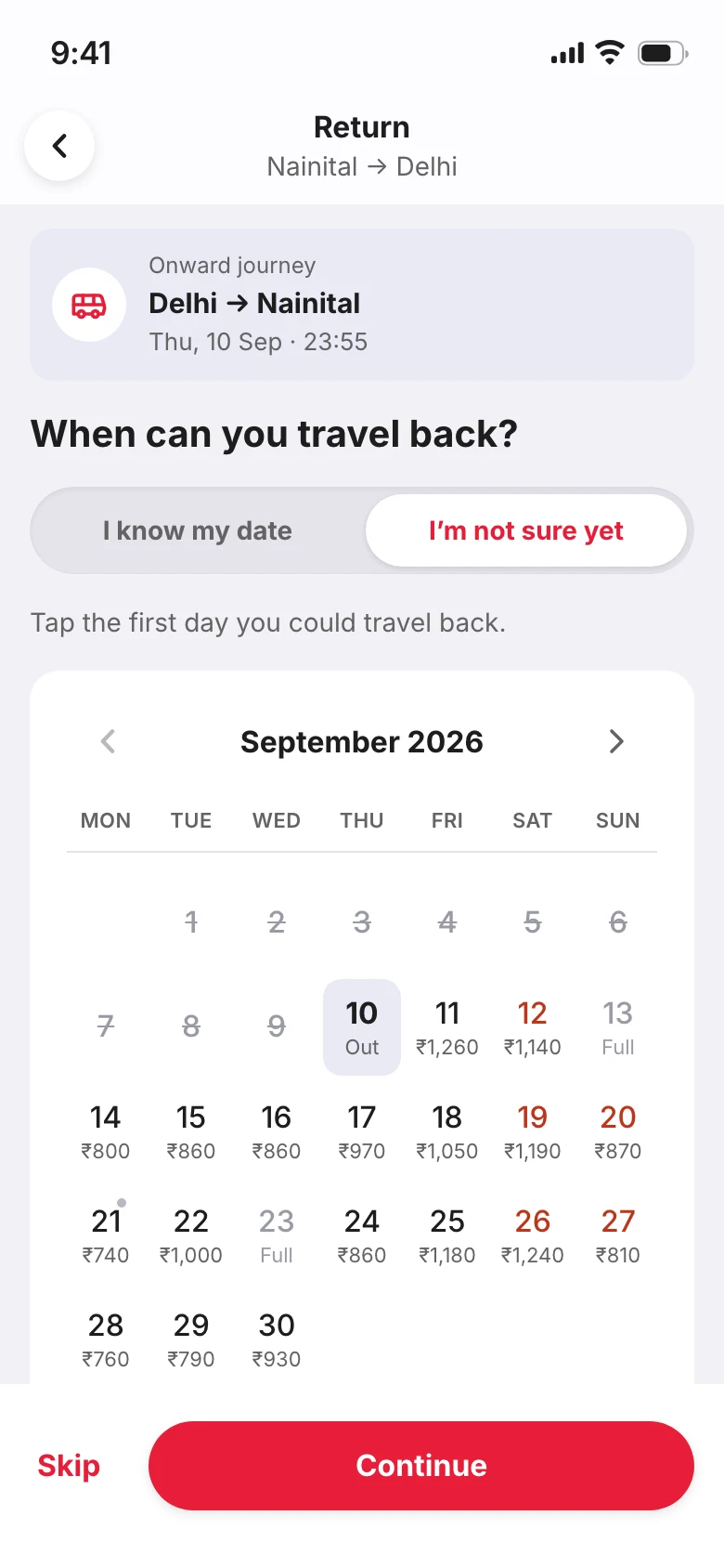
Every day shows its fare
the cheapest bus that can still change date
Scene 2Picking a day
She marks the days she could come back, then picks one.
How does she choose without comparing thirty buses? The days stay a short list, and her bus opens right under the day she picks.
The days stay a fixed list
whether a day has 2 buses or 30
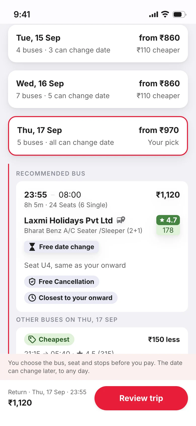
Her bus sits under her day
with the ones that beat it on price or rating
Scene 3Before paying
She sees the one catch before she pays.
One change, to any date. The only line in warning colour is the one that costs her: no cancelling after a change.
One change, to any date
she pays only the difference
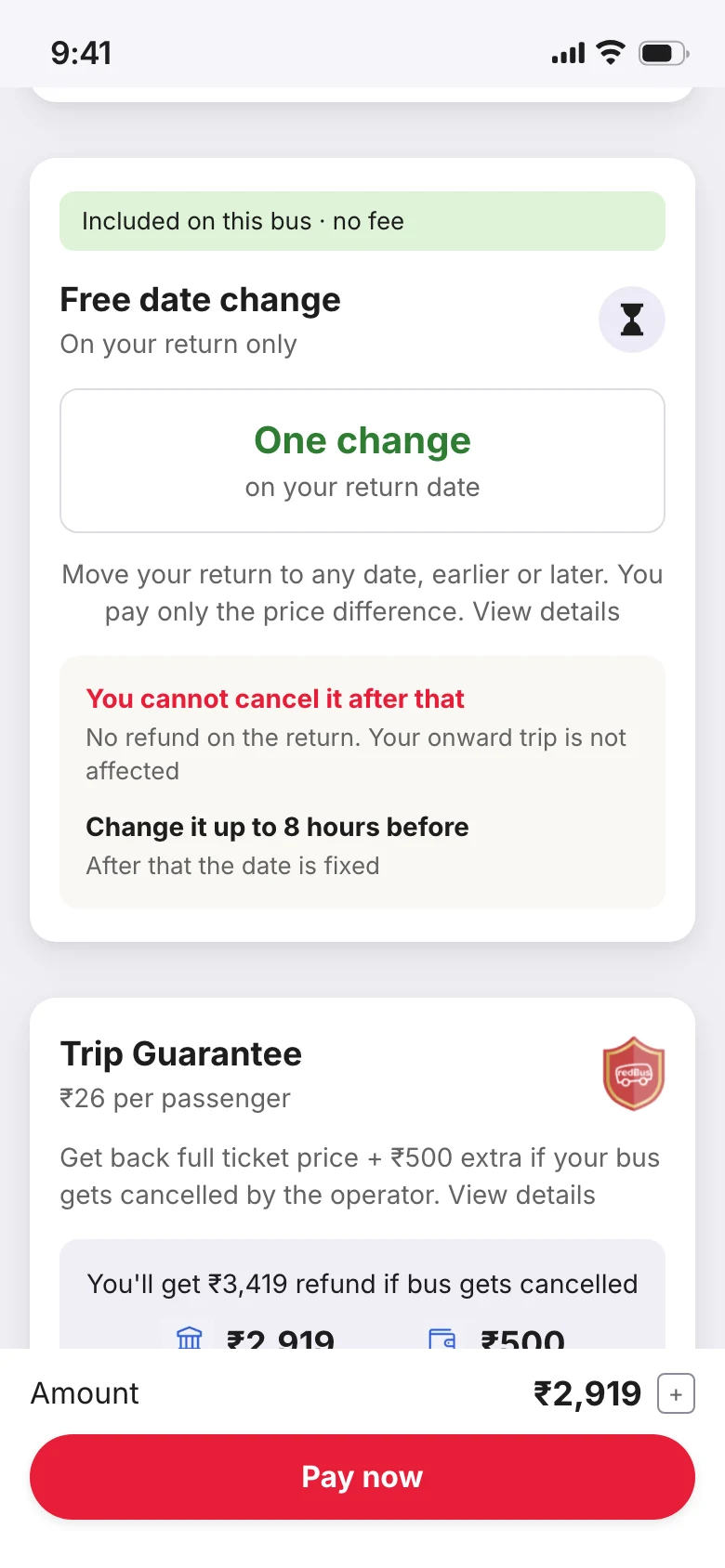
The only warning on the page
no cancelling after a change
Scene 4A week later
Her plans move, so she moves the ticket.
What will it cost? Every day on the calendar says. The new bus stays with the same operator, as RedBus requires.
The rule, before the choice
once she changes, no cancelling
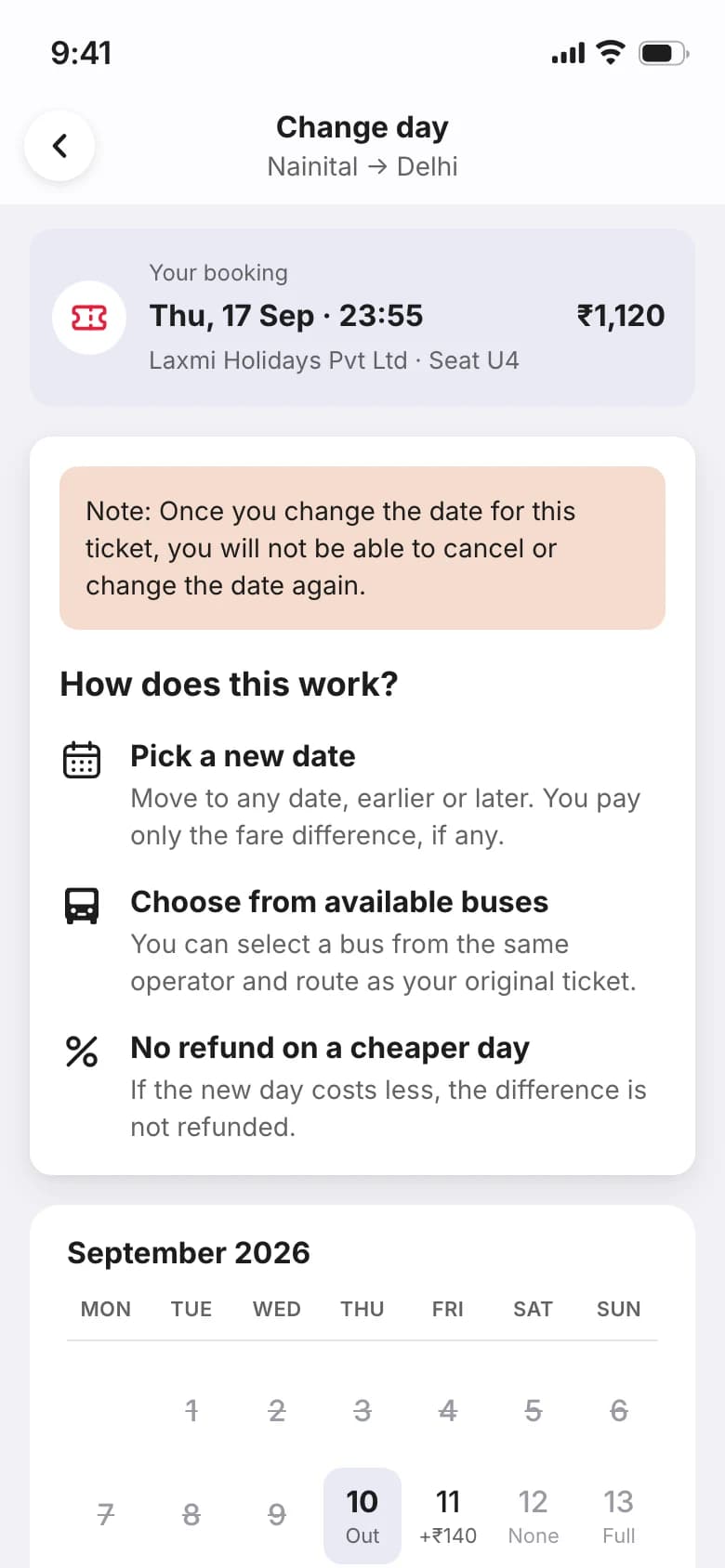
Every day says what the move costs
+₹140, None, Full
Scene 5Done
The app tells her what changed, and what she gave up.
The new day is ₹60 cheaper and she doesn't get that back. I kept celebration out of payment, so the good news waits for this screen.
What moved, and what it cost
even when the answer is "nothing back"
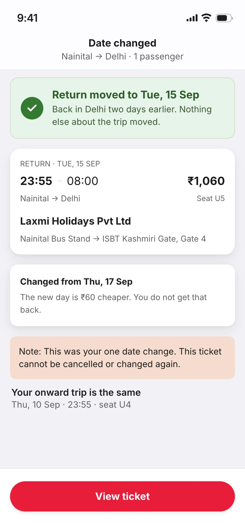
That was her one change
said plainly, where it happens
Scene 6When things break
When it can't keep a promise, it says what still holds.
There are 13 of these states. Here are three: still loading, nowhere to move to, and a seat someone else just took.
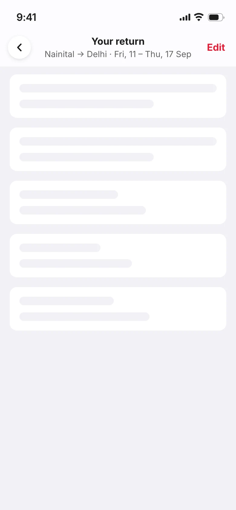
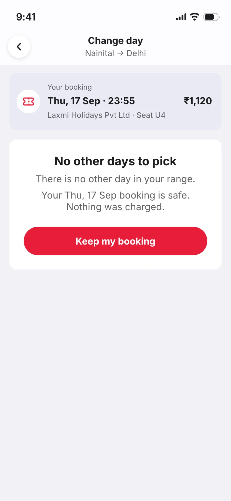
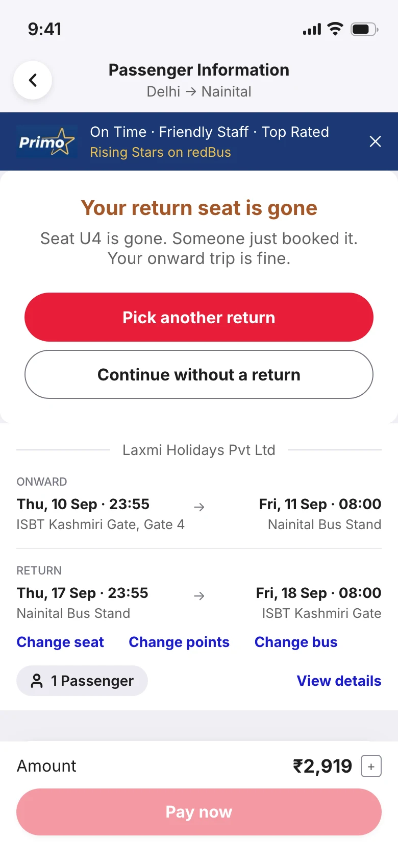
Success is scene 5.
In Figma
Every screen, on one canvas.
The final screens in Figma: six flows, with every way the promise can fail on the right. Open it full size to zoom in.
Act 3Behind the scenes
Getting here wasn't this clean
I won't walk you through every version. These are the moments that changed the design.
The mess
It started as 102 sticky notes.
Eight interviews and a survey, one observation per note, nothing deleted. Sorting them gave me six clusters and one problem to solve.
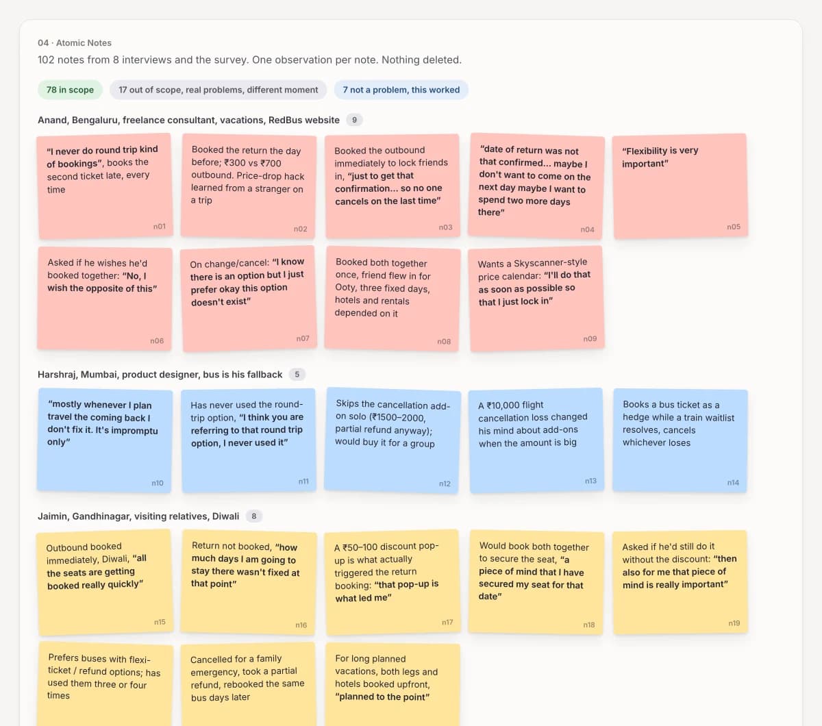
Part of the research board. See the whole board, with the jobs to be done and the brief.
Sixteen ideas
The obvious ideas died first.
Some already existed on RedBus. Some fixed a problem nobody had. Most still ended at a date picker. One kept the seat and the fare without asking for a date.
The one I picked
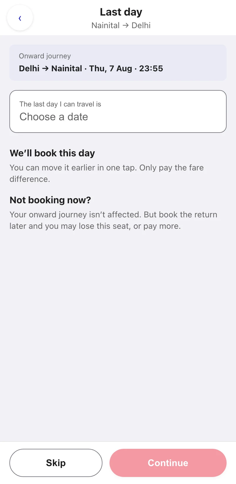
Book the last day you can travel
It keeps the seat and the fare without a date, and moves once when plans settle.
Later I moved past it. The final design is the window: you mark the days you could come back, then pick one.
- RedBus already does it3Add-your-return card, Book both, save ₹X, Badge flexible buses
- Fixes forgetting, and nobody forgets2Remind in two days, Ask when to remind
- Holds neither the seat nor the fare3Save the return, unbooked, Book a duration, Operator now, date later
- Still ends at a date picker2How-sure slider, Teach it your rule
- Out of my hands2Ask the group, Guaranteed seat at today's fare
- Folded into the pick2Show what waiting costs, Let the app decide
- Parked for next1Catch the moment plans settle
Idea 13 lost only on scope. It's what I'd build next.
Where it goes
I gave the return its own step, knowing it was the riskiest place.
I had three places to put it. A sheet on the review screen would have picked the return's boarding and drop points for you, and people choose buses by those stops. Samarth nearly missed a bus over a stop 800m away. Tweaking RedBus's existing screens would only reach people after they had paid.
A sheet on review
Changes to existing screens
Its own step in checkout
It was also the only option that could break my 95% limit. So Skip is as easy to see as Continue, and nothing on the step can block you, not even a confirmation dialog.
Attacking it
Then I attacked my own idea, and it came second.
I wrote eight attacks on it. The worst: after a change you can't cancel, so the people least sure of their plans could end up with the least refundable ticket.
Book the best day in a window
8 / 10Book the last day Mine
7 / 10When I scored every idea on merit, the window idea beat mine. So I built that next.
My mistake
I also wrote something false into the product.
Version 1 told travellers the date could only move earlier. That limit was mine, a shortcut I had stopped questioning. FlexiTicket always allowed later.
Version 1 said
"You cannot move it to a later day."
Now it says
"Move your return to any date, earlier or later."
I fixed it on the screens after payment first, and missed the one where people form the belief.
The demo
My mentor asked three questions I couldn't answer.
My mentor reviewed my work. In the demo I argued how it differed from FlexiTicket before admitting it was the same, and lost the argument. Two of his questions rested on facts I had in screenshots and never wrote down. Now I start by agreeing: it is FlexiTicket underneath, and what changes is what the app asks for.
"Users get free cancellation with FlexiTicket but not with yours."
My answer now
FlexiTicket refunds at least 50%. The full refund is a separate paid add-on.
"You should charge for this flexibility, like they charge for FlexiTicket."
My answer now
FlexiTicket is free. RedBus's own page says "at no extra rate".
"This construct IS a flexi-ticket. Why build it separately?"
My answer now
It is FlexiTicket. What changes is that you don't need a date to use it.
How I1
How I stopped booking the cheapest day.
Version 2 booked the cheapest day in a range, which pushed people to spend their only change. Version 3 booked the last day. Version 4 kept the days still, because a real route runs up to 30 buses a day.

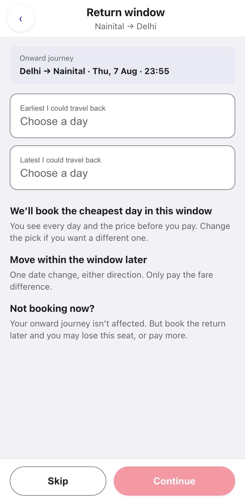
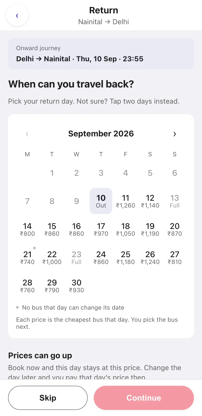
The real bus list for one day was 14 cards and 4,957 pixels long.
Pricing a day
I got the price on each day wrong twice.
First each day showed its default bus's fare, and the calendar and the day list disagreed by up to ₹230, one tap apart. Then each day showed its cheapest fare, but on 3 of 5 days that bus couldn't change its date. So the price that stood out belonged to a ticket that couldn't move, which is the one thing this flow is for.
Priced at the default bus
Priced at the cheapest bus
Priced at the cheapest bus that keeps the date change
The fix cost me a rule I liked: a night bus out used to mean a night bus back by default. Now that's a tag, one tap away.
Checking it for real
So I booked a real ticket to check one rule.
My design needed a date change to stay with the same operator, and nothing I'd read said so. I booked a FlexiTicket bus and opened Change travel date. It was right there.
Same operator, same route
my biggest open risk, closed
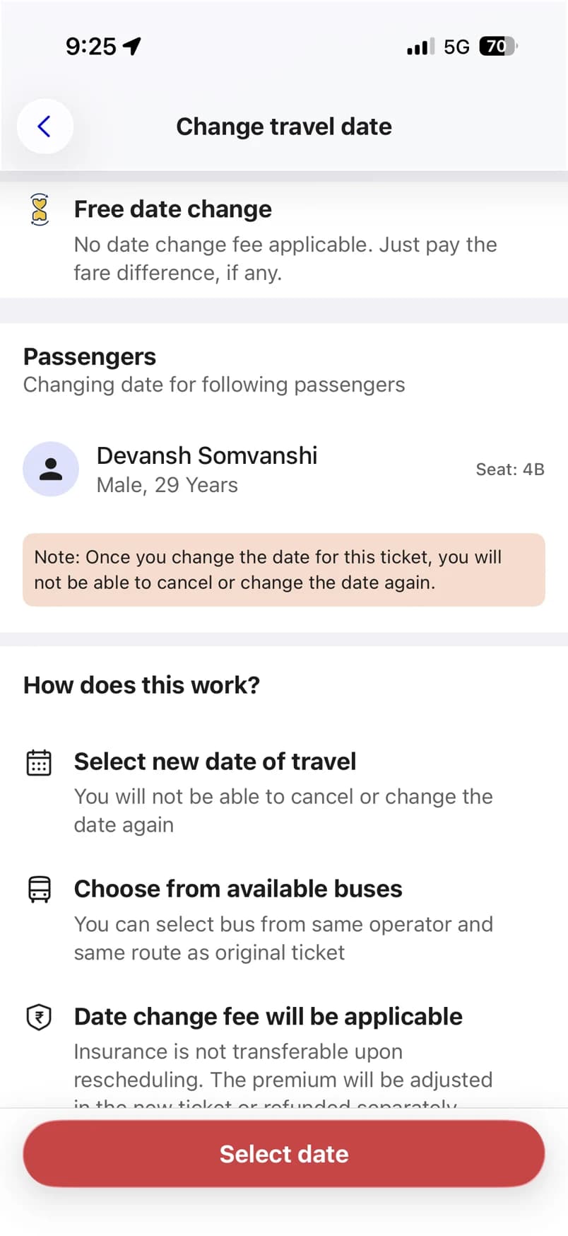
Change once, then no cancelling
the rule the whole design leans on
Pushing back
Then my mentor asked: isn't FlexiTicket better?
It moves you to any date, and mine capped you at a week. I kept the week, because it's how you book without a date. I just stopped it from limiting the ticket.
Before
You can change within your week
After
The week picks your day. The change can go to any date.
Both paths now reach 29 days.
Testing
I tested it against my own rules. It failed.
Before testing I wrote down what would kill the design, so I couldn't move the goalposts later. Two of those conditions came true.
Unsure people tap a single day
They take the cheapest day and can't move it
Nobody reads the rules
What they did
One line, read three wrong ways.
The calendar said "Not sure? Tap two days instead." Nobody used the window it was asking for.
"Ok I am not sure"
Vivek, out loud. Then he tapped Skip.
A day, then the next day
Tia's two taps. No window.
Two days in a row
How Sai read "tap two days".
"in this my seat is getting confirmed right?"
Vivek again. He thought every marked day held a seat.
Not one of them read a subheading, in any session.
How I2
How I made the calendar ask first.
Two answers sit above the calendar: "I know my date" and "I'm not sure yet". I borrowed the shape from Swiggy's "When?" toggle and kept one line under it, because two words alone is how Sai misread "tap two days".
My mentor spotted this problem three weeks before testing. It took three testers for me to see it.
How I3
Sai asked me to hide the risky buses. I didn't.
He took the cheapest day without seeing it couldn't change, and asked me to show only buses that can. That would hide the cheapest bus on the route, and price mattered to all three testers.
So I made the risk hard to miss
the day and its bus both say it can't change
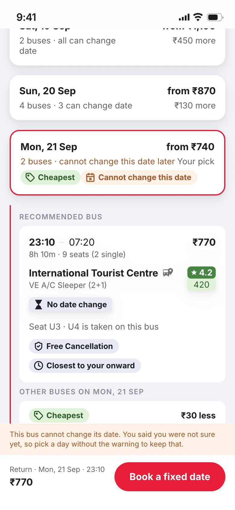
It names her own answer back
"You said you were not sure yet"
The button changes
"Book a fixed date", not "Review trip"
Sai still said he'd use this over today's flow, and wouldn't tap Skip. He had struggled the most.
What made the cut
Four weeks, one designer. Something had to go.
Each item has the reason it landed where it did. Most of the arguments were about what to say no to.
The design doesn't work without these
Book without a date
This is the idea itself. People wait on the return because they don't know the day yet, so asking them for a date doesn't work.
One change, to any date
The week only helps you pick a day. After that the ticket moves to any date, the same as FlexiTicket. My mentor pushed me here.
Every rule as a heading
In testing, nobody read a subheading. So each rule is the bold line itself.
Failure states
If the new seat goes mid-change, the old ticket stays safe, and the screen says that first.
Built once the core worked
Better buses under your day
Under the bus you picked, up to three others that beat it on something, like price or rating.
The full cancel flow
Four screens rebuilt from the real app, so cancelling works the way people already know.
Next, if this went further
Move a whole group together
If five people booked and only three seats are free on the new day, the group splits. That already happened to Tia. I'd offer the move only when everyone fits.
Routes with one bus a day
There, another day means a 24 hour jump. I haven't designed for it yet.
Said no, on purpose
Reminders
Of the people who put off the return, 0% said they forgot, so a reminder wouldn't help anyone.
Hide buses that can't move
Sai asked for it. It would hide the cheapest bus on the route, and price mattered to all three testers.
Charge for flexibility
FlexiTicket already changes dates at no extra rate. Charging would make mine worse than what RedBus gives today.
Separate return seat and stop screens
My mentor's idea, and he was right. The app picks them like your outbound, and you change them on the review screen. That took two screens out of the way before paying.
Act 4What's next
What I'd do if this shipped
Nothing here is live, so there are no results yet. Here's how I'd know.
What I'd watch
Three numbers, and when I'd pull it.
If returns rose 8% but outbound bookings fell 6%, I'd roll it back. That's trading trips for returns.
Returns added before paying
The number this should move
Outbound bookings, at least 95% of today's
Must not drop below that
Free Cancellation sales
Might dip, so watch it
Keeping
What I'm taking to the next project.
Three things this project taught me, mostly by getting them wrong first.
1The mentor demo
Write the facts down before the demo.
My mentor asked three questions I couldn't answer. Two of them rested on rules sitting in my screenshots folder, never written up. Now the rules I rely on go in a table before I present.
2Testing
Put the rule where people actually look.
The calendar's hint sat in small text under the heading. Not one tester read a subheading, in any session. Now every rule is the bold line.
3My own mistake
Fix a wrong belief where it starts.
The app said a ticket couldn't move to a later day, which wasn't true. I fixed the screens after payment first, and missed the one where people choose their day, which is where they got the wrong idea.
Thanks for reading.
Got a question, or a better idea? I'd love to hear it.